Terri Hallman: The Creative Process

You can find modern paintings in Chicago by many figurative artists, but not many as quirky as Wisconsin born, Terri Hallman. She is an extraordinarily driven and innovative artist. For Hallman, her art is in the process itself, which she regards as the essence of her work. On the surface, the work may appear simple, yet there is considerable emotional depth inherent in the artist’s multi-layered approach.


Terri begins her work with stick figures on paper. The loose and somewhat abstract forms act as a matrix for the composition. She then begins the laborious process of rubbing dry pigment (by hand) into the paper. Between the layers of pigment, she marks off sections with tape and leaves other areas unmasked.  The process is repetitive, in essence “revealing and discovering the nature of the subject.” The creative pace is intense and very hands-on; the result is supersaturated hues and curiously crude textures. In her own words: “It is the layers that expose the passage of time, how some things are covered up and how others are revealed.”


Hallman also employs symbolic elements in her works, assigning meaning to simple objects. A pea depicts nothingness, while a horse epitomizes freedom. One familiar element in her paintings is a bird, often perched on a shoulder, representing the trusted companion.  


Terri Hallman’s whimsical, figurative paintings are widely collected and featured in galleries throughout the US, Canada and Great Britain. As a top Chicago contemporary art gallery, Art Post Gallery exclusively represents Hallman’s work in the Chicago area.
Color Trends for 2017

Large Paintings - Art Galleries

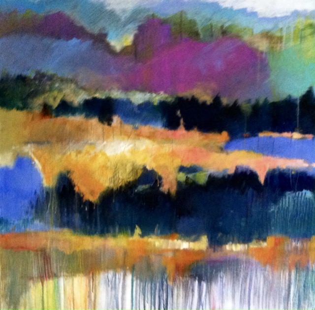
As we enter the New Year, take note…2017’s home trends call for a move away from rooms of predominately gray and taupe tones and towards a new pallet of jewel tones. These lush colors include greens, deep blues, amethyst, rose quartz and fiery orange. As a Chicago gallery specializing in large paintings, we have begun seeing our clients and designers take a greater interest in large, original artwork (and other home accessories) with much bolder colors to add a “pop” of interest in otherwise neutral rooms. Particularly in rooms with big, open spaces, large colorful paintings are needed to make a “statement.”


According to Sue Wadden of Sherwin Williams: “We’ve been watching green gain momentum in the last few seasons.  Look for deep emerald greens as well as the Pantone color of the year…’Greenery’ (a strong parrot green).” Pantone says: “Greenery represents refreshment, revitalization and optimism. This life affirming shade is something we could all benefit from in our complex social and political environment.”


Indigo blue also remains a popular color choice for a modern twist with a traditional feel. Navy blue pairs well with practically any color scheme and lends mystery to a space without making it feel small. Artwork with strong shades of blue is peaceful, serene and continues to be very much in demand.
Look for these color trends in art, home decor, fashion and commercial design in the New Year.  Maybe it’s time to embrace a color change and update the look and feel of your home.